Overview

On this page

Tools used

  • Figma, GitLab, GitHub
  • HTML/CSS, VS Code, Netlify
  • LaunchDarkly (A/B testing)
  • Notion, Canva, Miro
  • webaim.org
  • a11yproject.com/checklist

Case study
New platform for our partners' clients

Project overview

I arrived at this company at the launch of a new platform. The platform aimed to help more users accept photoshoots. V1 produced a favorable open rate but unfavorable conversion—most used the platform to refuse photoshoots.

The team decided to revamp the flow and the UX copy, originally written by non-writers. Cue my entry to the project.

Capture user interest

The V1 header added no value for users. We evolved from welcome to a question directly related to their bottom line—do they want more customers to see them? The answer is a quick yes. We also removed the refusal link from the first screen (it appears later).

Call-to-action text

Notice the change from Get Prepared to Let's Get Started for our call-to-action button. It's friendlier and uses a more accessible word (start vs. prepare). Though I don't usually choose first-person pronouns in CTAs (let's), the overall message helps establish a sense of community—we're in this together.

Explaining the offer

The original version didn't explain what we offered or what users needed to do. Instead, users were expected to schedule a date immediately without any effort from us to establish trust. I crafted three lines of text to walk users through the process, reinforcing the value at the end.

Text message announcement

The final step was to craft a professional yet friendly text message. Words like free, boost, and increase pique interest, and seeing their partner's name in the message (blurred) instills confidence.

A/B testing

A/B testing showed a decreased refusal rate of 14%. We demonstrated this by running tests with the old and new platforms and calculated the percentage with a 95% confidence interval.

Outcome: improved end-to-end user journey

Improving the platform text transformed the experience for this user group. Through a seamless three-step landing page, they went from not knowing why we were contacting them to understanding the value and simplicity of a photoshoot.

Examples
Culturally-sensitive & anti-racist choices

Overview

Let's review two examples where I noticed something culturally insensitive or racially charged and respectfully proposed a change. The goal is always to increase knowledge and create a safe environment for everyone, staff and users alike.

Racially-charged language

Upon arrival at a new company, I heard the term blacklist used to classify users who were no longer allowed access to the platform. I addressed this immediately and most colleagues shifted to blocklist. This wasn’t the ideal choice for the company because we used block for something else, so we discussed it as part of a terminology standardization effort and ultimately chose suspended.

The entire company adopted the change and all internal documentation and platforms were updated quickly. Bottom line: words matter, and we can have uncomfortable conversations respectfully as we create great products to use and healthy places to work.

Co-opted practices

A design project ended with an invitation to take a break while an application processed. The concept was kind and human-centered, but the text was not precise and the team selected a graphic of a person doing yoga. The project had the potential to be seen by users worldwide, including users who practice yoga as part of their religious and cultural traditions.

I explained politely why using this image risked being disrespectful, then suggested switching to a more relevant graphic. The team accepted my recommendation and we updated the UX text to mirror the change. The result was clearer than the original and culturally aware.

Case study
Full website design for a countryside bed & breakfast

Project overview | www.tumuli.fr

New managers took over a countryside bed & breakfast and wanted to bring their website into 2022 in French and English.

My role included content design, web design and development, and translation with attention to transcreation from French to English.

Content analysis

The new managers analyzed the existing content and provided a list of topics to include on the new website. I structured that content, grouping similar topics together and creating a clear distinction between reservation options. Working directly with one manager, we wrote the content in French (I guided, she wrote), then I built the site around that content.

Microcopy

All button text and titles are consistent and clear throughout the site. Language buttons do not use flags but instead the name of the language in that language. All images have concise alt text.

Accessibility

I ran the site through over 80 accessibility checks, including color contrast, alt text, keyboard navigation, and logical hierarchy.

Outcome: modern site guests love & use

The new managers are thrilled with their new website. They have a higher occupancy rate and observed a direct reservation increase of over 50%. This means that clients reserve directly through their site instead of third-party reservation sites, resulting in significant savings. Guests love the site as well; it's a win for everyone!

Case study
Reusing content & storytelling with headings

Project overview | www.mimicoco.fr

My wife and I created an inclusive sticker initiative. I designed the stickers based on LGBTQIA+ identity flags, designed and built the website, and (surprise!) wrote all content for the information cards, website, and glossary. We translated it from English to French together.

Some principles are the same as the previous case study, notably the microcopy and accessibility. I'll highlight the ability to adapt content for a postcard-size information card and a full glossary entry, plus how I wrote a short narrative with headings.

Content adaptation

I adapted content that can be delicate to explain for both short and long formats, specifically an information card and a glossary entry.

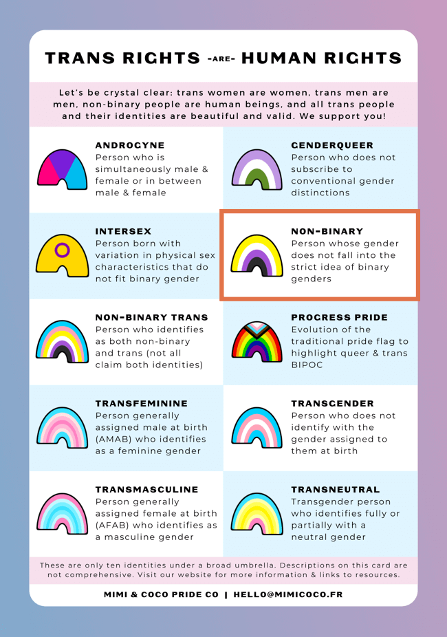
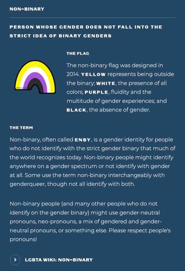
Included with each sticker pack is a bilingual, double-sided, postcard-size information card with a brief description of each of the ten stickers. I had approximately 80 characters to work with to introduce nuanced identities. The glossary added more detail, an explanation of the flag, and links to resources. The hope was that the information card would be a first taste, motivating readers to visit the website to learn more.

Storytelling

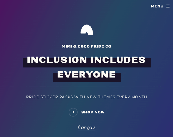
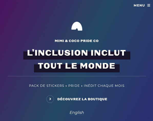
The purpose of this project needed to be crystal clear, so I used headings to introduce the story.

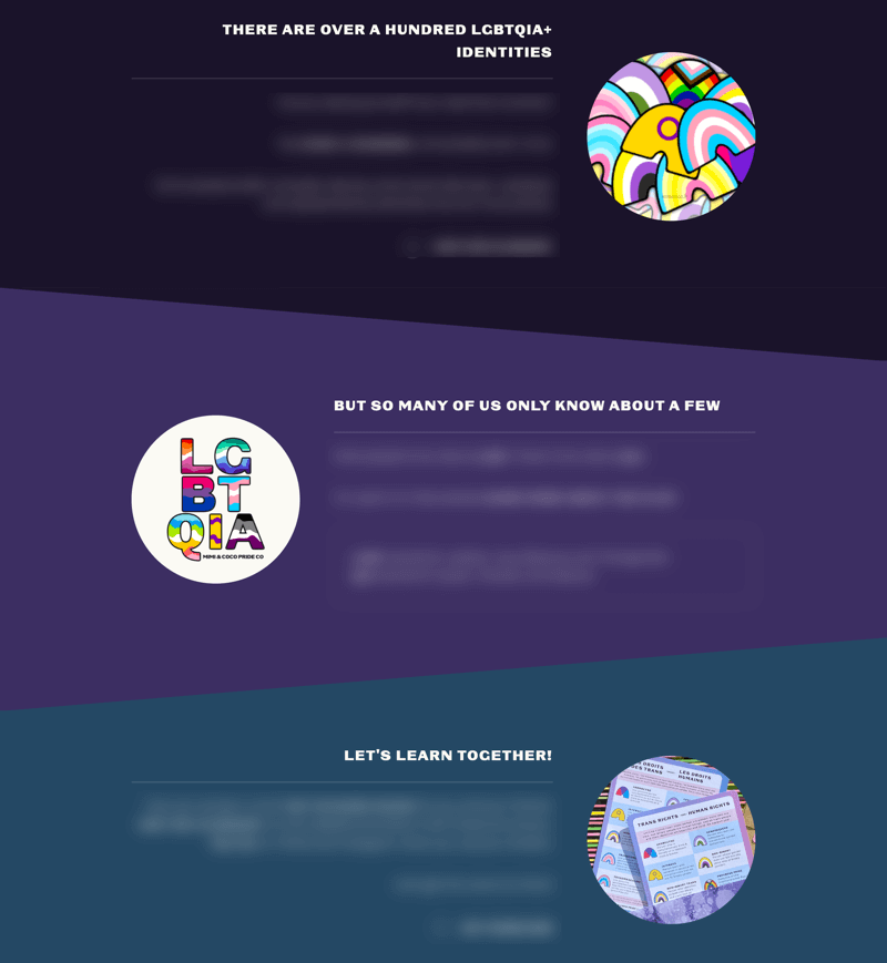
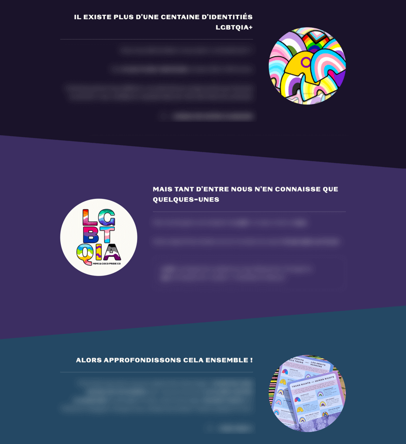
1. There are over a hundred LGBTQIA+ identities,
2. but so many of us only know about a few.
3. Let's learn together!

In three simple phrases, readers understand the immensity of our community and are invited to participate to learn together.

End of sample

© Coley Woyak. All rights reserved.
Original design: Paradigm Shift by HTML5 UP & customized by yours truly.